开源软件名称(OpenSource Name):JSLancerTeam/react-google-flight-datepicker
开源软件地址(OpenSource Url):https://github.com/JSLancerTeam/react-google-flight-datepicker
开源编程语言(OpenSource Language):
JavaScript
82.5%
开源软件介绍(OpenSource Introduction):react-google-flight-datepicker


Google flight date picker implemented in ReactJS
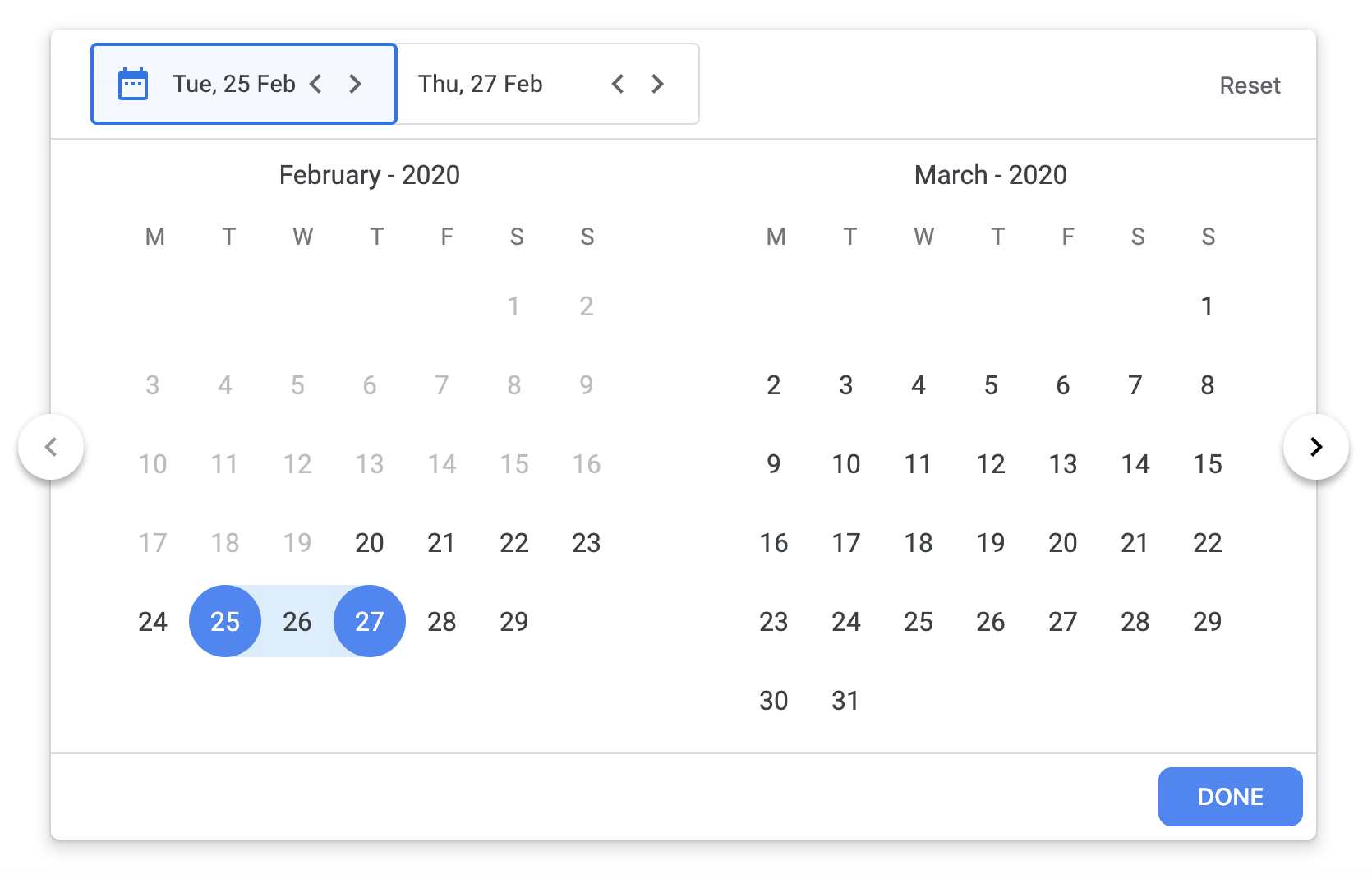
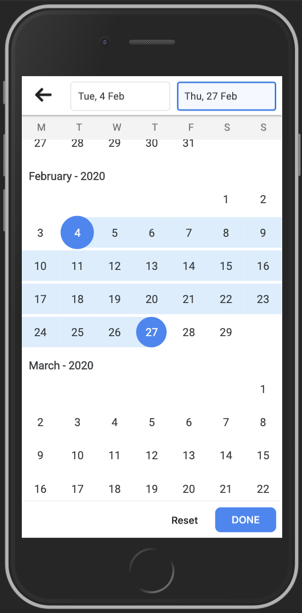
Demo
Screenshot


Usage
RangeDatePicker
import { RangeDatePicker } from 'react-google-flight-datepicker';
import 'react-google-flight-datepicker/dist/main.css';

<RangeDatePicker
  startDate={new Date()}
  endDate={new Date()}
  onChange={(startDate, endDate) => onDateChange(startDate, endDate)}
  minDate={new Date(1900, 0, 1)}
  maxDate={new Date(2100, 0, 1)}
  dateFormat="D"
  monthFormat="MMM YYYY"
  startDatePlaceholder="Start Date"
  endDatePlaceholder="End Date"
  disabled={false}
  className="my-own-class-name"
  startWeekDay="monday"
/>
SingleDatePicker
import { SingleDatePicker } from 'react-google-flight-datepicker';
import 'react-google-flight-datepicker/dist/main.css';

<SingleDatePicker
  startDate={new Date()}
  onChange={(startDate) => onDateChange(startDate)}
  minDate={new Date(1900, 0, 1)}
  maxDate={new Date(2100, 0, 1)}
  dateFormat="D"
  monthFormat="MMM YYYY"
  startDatePlaceholder="Date"
  disabled={false}
  className="my-own-class-name"
  startWeekDay="monday"
/>
Props
| Prop name |
Prop type |
Default value |
Description |
| startDate |
Date |
null |
Selected start date |
| endDate |
Date |
null |
Selected end date |
| dateFormat |
String |
D |
Display format for date. Check momentjs doc for information (https://momentjs.com/docs/#/displaying/) |
| monthFormat |
String |
MMM YYYY |
Display format for month. Check momentjs doc for information (https://momentjs.com/docs/#/displaying/) |
| onChange |
Function |
null |
Event handler that is called when startDate and endDate are changed |
| onFocus |
Function |
null |
Return a string (START_DATE, END_DATE) which indicate which text input is focused |
| minDate |
Date |
1900 Jan 01 |
Minimum date that user can select |
| maxDate |
Date |
2100 Jan 01 |
Maximum date that user can select |
| className |
String |
|
Custom CSS className for datepicker |
| disabled |
String |
false |
Disable the datepicker |
| startDatePlaceholder |
String |
Start Date |
Placeholder text for startDate text input |
| endDatePlaceholder |
String |
End Date |
Placeholder text for endDate text input |
| startWeekDay |
String (monday or sunday) |
monday |
Determine the start day for a week (monday or sunday) |
| highlightToday |
Bool |
false |
Hightlight "today" date |
| singleCalendar |
Bool |
false |
Only applicable on SingleDatePicker. When this prop is actived, the datepicker will display 1 calendar instead of 2 calendar in the the container |
Author
License
MIT

|

 客服电话
客服电话
 APP下载
APP下载

 官方微信
官方微信


请发表评论