For best display effect, you should generate your diff text with git diff -U1 command.
The {File[] parseDiff({string} text, {Object} [options]) named export is a wrap of gitdiff-parser package with some extra options:
{string} nearbySequences: The action to take when meet nearby sequences, only the "zip" value has its own behavior.
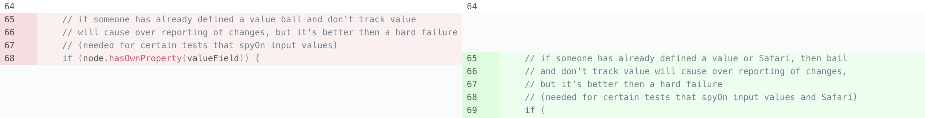
The nearbySequences can have a value of "zip" to "zip" a sequences of deletion and additions, as an example, here is a diff generated from react:
- // if someone has already defined a value bail and don't track value- // will cause over reporting of changes, but it's better then a hard failure- // (needed for certain tests that spyOn input values)- if (node.hasOwnProperty(valueField)) {+ // if someone has already defined a value or Safari, then bail+ // and don't track value will cause over reporting of changes,+ // but it's better then a hard failure+ // (needed for certain tests that spyOn input values and Safari)
This is the normal behavior, which will displayed as 3 lines of deletion, 1 line of modification and 3 lines of addition:
When the value "zip" is passed, the diff will be modified to:
- // if someone has already defined a value bail and don't track value+ // if someone has already defined a value or Safari, then bail- // will cause over reporting of changes, but it's better then a hard failure+ // and don't track value will cause over reporting of changes,- // (needed for certain tests that spyOn input values)+ // but it's better then a hard failure- if (node.hasOwnProperty(valueField)) {+ // (needed for certain tests that spyOn input values and Safari)
and as a result rendered as:
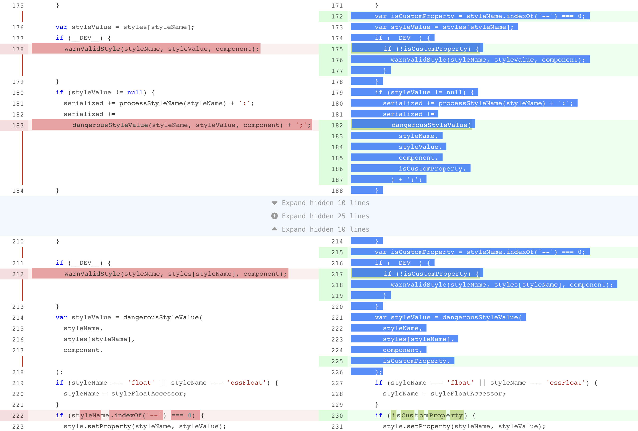
In most cases it can provide a better look in split view.
Render diff hunks
The Diff named export is a component to render a diff, a simplest case to render a diff could be:
The children is optional if you only need all hunks to be displayed, however you can use this function children to add custom events or classes to hunks.
As you can see, Diff component requires a hunks prop as well as a function children prop which receive the hunks prop as its argument, this may looks redundant but actually very useful when work with HOCs modifying hunks. For example, we have a HOC to remove all normal changes:
We can still pass original hunks to MyDiff, however all normal changes are removed from the hunks argument in children prop.
Here is the full list of its props:
{Object[] hunks}: Hunks of diff.
{Function} children: A function which receives an array of hunks and returns react elements.
{string} viewType: Can be either "unified" or "split" to determine how the diff should look like.
{string} className: An extra css class.
{Object} customEvents: An object containing events for different part, see Customize events section for detail.
{Object} customClassNames: An object containing css classes for different part, see Customize styles section for detail.
{string[]} selectedChanges: An array of selected changes's key, these changes will be highlighted.
{Object} widgets: An object of {changeKey: element} to render widget for changes, see Add widgets section for detail.
{string} gutterType: How the gutter cell should be rendered, can be either "default" to render only the line number, "none" to hide the gutter column, or "anchor" to render line number as an <a> element so user can click gutter to scroll to corresponding line.
{Function} generateAnchorID: A function to generate a DOM id attribute for each change, this is required when gutterType is set to "anchor". Provided function receives a change object as the only argument and should return either a string or undefined, if undefined is returned no id attribute will be placed on DOM. The id attribute will be placed on the gutter <td> element, for normal changes in split mode, only the left side gutter will have the id attribute.
{boolean} optimizeSelection: Whether to optimize selection to a single column, when this prop is set to true in split mode, user can only select code from either old or new side, this can help copy and paste lines of code. This feature can cause some performance dropdown when the diff is extremely large, so it is turned off by default.
{Function} renderToken: A function to render customized syntax tokens, see Pick ranges section for detail.
{Function} renderGutter: A function to render content in gutter cells, see Customize gutter section for detail.
Key of change
In selectedChanges and widgets props the key of change is used to match a specific change, a change's key is simply a string computed by the following rules:
In some cases we need functions like commenting on change, react-diff-view provides an extensible solution called widget to archive such scenarios.
A widget is any react element bound to a change object, a widget is configured in an object with change and element property, when rendering diff changes, if there is a widget object with the same change object, the element will be rendered below the line of code.
In split view a widget will be rendered to its corresponding side if change object is of type addition or deletion, otherwise the widget will be rendered across the entire row.
Note although the widgets prop is of type array, each change can only render one widget, so if there are entries with the same change property, only the first one will be rendered.
Here is a very basic example which adds a warning text on long lines:
import{parseDiff,getChangeKey,Diff}from'react-diff-view';constgetWidgets=hunks=>{constchanges=hunks.reduce((result,{changes})=>[...result, ...changes],[]);constlongLines=changes.filter(({content})=>content.length>120);returnlongLines.reduce((widgets,change)=>{constchangeKey=getChangeKey(change);return{
...widgets,[changeKey]: <spanclassName="error">Line too long</span>};},{});};constApp=({diffText})=>{constfiles=parseDiff(diffText);return(<div>{files.map(({hunks},i)=><Diffkey={i}hunks={hunks}widgets={getWidgets(hunks)}viewType="split"/>)}</div>);};
For a more complex case, you can reference the example in demo/File.js about implementing code comments with the widgets prop.
Customize styles
The basic theme of react-diff-view is simply "picked" from github, with some additional colors for column diffs, the style is located at react-diff-view/style/index.css, you can simply import this file in your project.
CSS variables
react-diff-view includes a bunch of css variables (custom properties) to customize the presentation of diff in supported browsers, these includes:
For code highlight colors, we recommend prism-color-variables package which includes CSS variables of every refractor generated token type.
Class names
You can override styles on certain css classes to customize the appearance of react-diff-view, here is a list of css classes generated by component:
diff: The diff container, a <table> element.
diff-gutter-col: The <col> element to control the gutter column.
diff-hunk: The <tbody> element representing a diff hunk.
diff-decoration: The <tr> element representing the decoration row.
diff-decoration-gutter: The <td> element corresponding to gutter within decoration.
diff-decoration-content: The <td> element corresponding to code content within decoration.
diff-gutter: The <td> element containing the line number.
diff-gutter-normal: Gutter of a normal change.
diff-gutter-insert: Gutter of an addition.
diff-gutter-delete: Gutter of a deletion.
diff-gutter-omit: Gutter with no content.
diff-gutter-selected: Gutter of a selected change.
diff-line: The <tr> element for a diff line.
diff-line-old-only: The <tr> element which only contains the left side columns, appears in split view
diff-line-new-only: The <tr> element which only contains the right side columns, appears in split view
diff-code: The <td> element containing code.
diff-code-normal: Code of a normal change.
diff-code-insert: Code of an addition.
diff-code-delete: Code of a deletion.
diff-code-omit: Code with no content.
diff-code-selected: Code of a selected change.
diff-code-edit: Edits on a line of code.
diff-code-mark: Marked word on a line of code.
diff-widget: The <tr> element to render widget.
diff-widget-content: The <td> element to render widget content.
diff-line-hover-old: The <td> element of the old side gutter and code which is currently hovered.
diff-line-hover-new: The <td> element of the new side gutter and code which is currently hovered.
The diff-line-hover-(old|new) class is especially designed to tell the precise hover element in split mode, so it only applies when viewType is set to "split", if you want a style on a hovering change, the selector could be:
// Less selector to disable the line number and add an icon in the gutter element when a change is hovered.diff-line-hover-old.diff-gutter,
.diff-line-hover-new.diff-gutter,
.diff-unified.diff-line:hover.diff-gutter {
&::before {
font-family: "FontAwesome";
content: "\f4b2"; // comment-plus
}
}
You can pass the className prop to a Diff component to add a custom class to the <table> element.
The Hunk component receives class name props as:
className: The class name of hunk's root <tbody> element.
lineClassName: The class name of each change's <tr> element.
gutterClassName: The class name of the gutter <td> element in each row.
codeClassName: The class name of the code <td> element in each row.
Similarly Decoration component also receives some props to customize class names:
className: The class name of decoration's root <tr> element.
gutterClassName: The class name of the gutter <td> element.
contentClassName: The class name of the content <td> element.
Customize events
The Hunk component receives gutterEvents and codeEvents props to customize events on either gutter or code <td> element.
Both of the above prop is an object containing DOM events key/value pair.
Each event callback receive an object with key change and side, the side property is undefined in unified mode, in split mode it could be either "old" and "new" responding to the triggering element.
One of the common cases is to add code selecting functionality. This can be archived simply by passing an onClick event to gutter and coe and manipulating the selectedChanges prop:

 客服电话
客服电话
 APP下载
APP下载

 官方微信
官方微信


请发表评论