Here you'll find a basic python script to retrieve data behind the trajectories plotted on the Google Ngram Viewer. A Python script that creates XKCD style plots from the ngram CSV data is also included, making it simple to create some awesome looking plots!
Simply type the same query you would type at the Google Ngram Viewer and retrieve the data in csv format.
Quick Gotchas
By default, the data is printed on screen and saved to a file in the working directory.
Add the -plot option to your query and an XKCD style plot like the one to the left will be saved in the working directory as well.
Searches are case-sensitive by default. To perform case-insenitive searches, pass the -caseInsensitive option to your query. The result will be the sum of all common formats of the query (lowercase, uppercase, titlecase, etc).
The syntax for modifier and wildcard searches has been slightly modified in order to make the script work as a command line tool. See below for more information on these minor changes.
Options
corpus [default: eng_2012] This will run the query in CORPUS. Possible values are recapitulated below and here.
** This can be used with inflection, wildcard, and case-insensitive searches (otherwise it does nothing) where one column is the sum of some of the other columns (labeled with a column name ending in "(All)" or an asterisk for wildcard searches). In the Google Ngram Viewer, the columns whose sum makes up this column is viewable by right clicking on the ngram plot. In the getngrams.py script, these columns are dropped by default, but you can keep them by adding -alldata to your query.
Examples
There are tons of examples below that demonstrate of all kinds of available queries.
Basic Examples
Here are some basic example uses of getngrams.py:
python getngrams.py Albert Einstein, Charles Darwin
python getngrams.py aluminum, copper, steel -noprint
python getngrams.py Pearl Harbor, Watergate -corpus=eng_2009
python getngrams.py bells and whistles -startYear=1900 -endYear=2001 -smoothing=2
python getngrams.py internet --startYear=1980 --endYear=2000 --corpus=eng_2012 -caseInsensitive
More Complicated Examples
Wildcard Searches
As in the full Google Ngram Viewer, you can also perform wildcard searches using getngrams.py.
When doing a wildcard search, use the ? character instead of the * character. Using an asterisk will cause the getngrams.py script to fail because your shell will expand the asterisk before Python has a chance to see it.
python getngrams.py United ? --startYear=1850 --endYear=2000 -alldata
python getngrams.py University of ?
python getngrams.py University of ?, ? State University -alldata
Modifier Searches
Modifier searches let you see how often one more modifies another word. The usual syntax for doing a modifier search is by using the => operator. For example, running the query dessert=>tasty would match all instances of when the word tasty was used to modify the word dessert.
Modifier searches can be done using getngrams.py, but you must replace the => operator with the @ character.
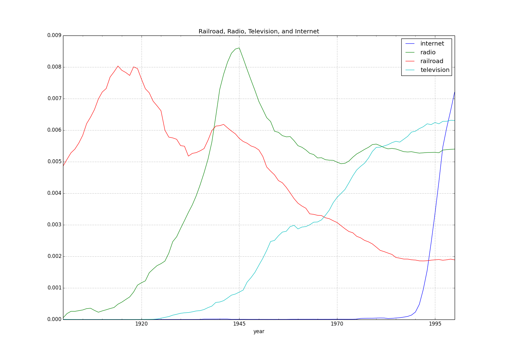
There are 2 easy ways to create your own plots using a CSV file produced by running a query with getngrams.py. To demonstrate the 2 methods, we'll run the following query:
The first way to create a plot is to use the supplied xkcd.py script to generate awesome XKCD style charts. However, there are two ways to use the script:
Add the -plot option to your command when running getngrams.py:
Another way to plot data from an ngram CSV file is to read the file into a pandas DataFrame object and call the .plot() option on it. Here we do that, but also convert the data to percentages first and add a title to the plot:
Moreover, PLEASE do respect the terms of service of the Google Ngram Viewer while using this code. This code is meant to help viewers retrieve data behind a few queries, not bang at Google's servers with thousands of queries. The complete dataset can be freely downloaded here. This code is not a Google product and is not endorsed by Google in any way.

 客服电话
客服电话
 APP下载
APP下载

 官方微信
官方微信


请发表评论